

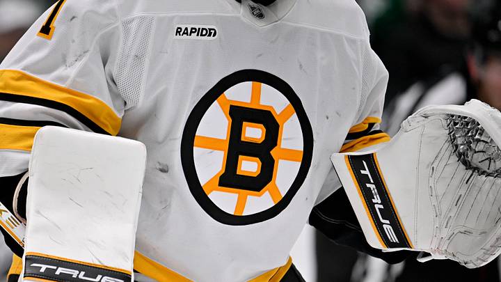
The Boston Bruins were the first team from America to enter the original 6 back in 1924. Those first sweaters reflected the brown-and-yellow color scheme, but did not yet showcase the infamous spoked-B we know and love today. So, where did that logo come from? Time to dig into the archives to understand the symbolism of the familiar pattern we currently recognize.
The Spoked-B roots
One world war and a quarter of a century after their inaugural season, the Bruins wanted to celebrate the franchise's 25th anniversary by instituting a permanent statement on the team uniforms. Hence, the birth of the spoked-B. The 1932-1933 season was when we first were introduced to the blocked B. It was in 1946 when the Bruins took a page, quite literally, out of Oliver Wendell Holmes' 1858 philosophical essay collection entitled The Autocrat of the Breakfast Table. In his book, Mr. Holmes describes the Massachusetts State House in Boston as the hub of the solar system. Our beloved spoked-B is a nod to Boston being the hub, or the center of it all - a fact which nary a Bostonian would refute still today.
Consistent while constantly changing
Throughout the succeeding years of black-and-gold history, the spoked B has changed looks a few times, but remains just as prominent today as it ever was. Sometimes you will find the big B outlined in gold, while other times it has a black border. Nonetheless, the blocked B sits inside a wagon wheel with 8 spokes, all pointing towards the hub.
Highly recognizable
The spoked-B logo is so recognizable that it actually takes the #8 spot on the NHL's greatest logos, and holds the #9 spot for NHL greatest logos of all time. The Florida Panthers come in at #10 on the latter list, indicative that even Sports Illustrated recognizes the Hub's greatness over the chirping Panthers. Whether or not the spoked-B will be sporting an updated look this forthcoming season remains to be seen. In any event, you'll be sure to recognize the pattern with the 8 spokes, reminding everyone that all roads lead to Boston, the hub of everything.
 Add us as a preferred source on Google