Top 10 Boston Bruins Uniforms Of All Time

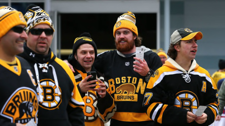
FOXBORO, MA - JANUARY 01: Boston Bruins fans enter the stadium prior to the 2016 Bridgestone NHL Winter Classic against the Montreal Canadiens at Gillette Stadium on January 1, 2016 in Foxboro, Massachusetts. (Photo by Maddie Meyer/Getty Images)
7 of 11
Next
BOSTON, MA – MAY 08: Fans react after Jake DeBrusk #74 of the Boston Bruins scores in the second period against the Carolina Hurricanes in Game Four of the First Round of the 2022 Stanley Cup Playoffs at TD Garden on May 8, 2022 in Boston, Massachusetts. (Photo by Adam Glanzman/Getty Images)
BOSTON, MA – MAY 08: Fans react after Jake DeBrusk #74 of the Boston Bruins scores in the second period against the Carolina Hurricanes in Game Four of the First Round of the 2022 Stanley Cup Playoffs at TD Garden on May 8, 2022 in Boston, Massachusetts. (Photo by Adam Glanzman/Getty Images) /

The 2022 NHL preseason is officially upon us, and outside of who will be replacing some of the more important players at the beginning of the season, jersey talk seemed to dominate the headlines in Boston. With the addition of advertisements to NHL jerseys for the upcoming season the Bruins will be sporting another logo on their sweaters. The team will also be revealing at least one, possibly two, new uniforms for the 2022-23 campaign. Reverse Retro jerseys will be making a comeback, and the Bruins are slated to participate in the 2023 Winter Classic. With speculation of a certain logo set to return, here are the Top 10 Bruins uniforms of all time.

TORONTO – DECEMBER 19: Marc Savard #91of the Boston Bruins moves the puck during the game against the Toronto Maple Leafs on December 19, 2009 at the Air Canada Centre in Toronto, Ontario, Canada. (Photo by Abelimages/Getty Images)
TORONTO – DECEMBER 19: Marc Savard #91of the Boston Bruins moves the puck during the game against the Toronto Maple Leafs on December 19, 2009 at the Air Canada Centre in Toronto, Ontario, Canada. (Photo by Abelimages/Getty Images) /

10.) 2008-16 Alternate

One year into the new Reebok Edge jerseys the NHL brought back alternates. This is the first time in the history of the Boston Bruins that a uniform would feature a black sweater with black socks. The base of it is sharp. Not too much going on, just the simple stripes at the elbows and knees. Having an all-black uniform was a great idea for an alternate jersey. I think it’s a travesty that it has become the norm. The 2008-16 alternates are a clean looking combination, but if there’s one drawback it’s the shoulders. There’s something unnatural about having the spoked B anywhere but the front. I remember the jerseys from this era being “revolutionary” and really taking the speed of the game to the next level. I give the team credit for taking a chance, but I never think of any team in all-black as being particularly fast. Colorful uniforms just make teams look faster.

24 Mar 1997: Center Anson Carter of the Boston Bruins looks on during a game against the Montreal Canadiens at the Forum in Montreal, Quebec. The Canadiens won the game, 3-1. Mandatory Credit: Robert Laberge /Allsport
24 Mar 1997: Center Anson Carter of the Boston Bruins looks on during a game against the Montreal Canadiens at the Forum in Montreal, Quebec. The Canadiens won the game, 3-1. Mandatory Credit: Robert Laberge /Allsport /

9.) 1995-06 Alternate

Perhaps the most controversial jersey in the history of the Boston Bruins, the 1995-96 alternates were a bold step for an organization that holds tradition close to the heart. The infamous Pooh Bear logo is obnoxiously large and does not exactly strike fear into the opponent. But other than that, there’s really nothing wrong with it. The detail on the shoulders and forearms certainly give off more of a ferocious feeling than the friendly-faced Fuzzy Wuzzy. This is the first time since 1967 that the Bruins would sport a gold jersey. That, combined with the gold socks, definitely make the uniform appear faster in comparison to an all-black one. Plus, this was the jersey the team was wearing when I went to my first game in Boston. A 4-1 win over the Florida Panthers on February 9, 2002. The teams combined for six fighting majors and 154 PIM.

BOSTON – APRIL 19: Left wing Sergei Samsonov #14 of the Boston Bruins and his teammate center Michael Nylander #92 chase the puck during game seven of the Eastern Conference Quarterfinals against the Montreal Canadiens at the Fleet Center on April 19, 2004 in Boston, Massachusetts. The Canadiens won 2-0. (Photo by Ezra Shaw/Getty Images)
BOSTON – APRIL 19: Left wing Sergei Samsonov #14 of the Boston Bruins and his teammate center Michael Nylander #92 chase the puck during game seven of the Eastern Conference Quarterfinals against the Montreal Canadiens at the Fleet Center on April 19, 2004 in Boston, Massachusetts. The Canadiens won 2-0. (Photo by Ezra Shaw/Getty Images) /

8.) 1995-06 Away

The 1995-06 away uniforms are one of two appearing on this list that at one point were the home uniforms. These jerseys launched the Bruins into another era. With construction of the Fleet Center complete, it was time for the B’s to reboot their entire look. It might be a subtle change, but this is the first time in the franchise’s history that a black B was on a black jersey. The jerseys also re-introduced the gold shoulders after being removed in 1974. These shoulders notably featured a white stripe that separated them from the rest of the jersey. In the past, the stripes at the elbow went all the way around the arm. This is another sentimental uniform since it’s the one I grew up with.

SOUTH BEND, INDIANA – JANUARY 01: Colby Cave #26 of the Boston Bruins skates in the second period against the Chicago Blackhawks during the 2019 Bridgestone NHL Winter Classic at Notre Dame Stadium on January 01, 2019 in South Bend, Indiana. (Photo by Gregory Shamus/Getty Images)
SOUTH BEND, INDIANA – JANUARY 01: Colby Cave #26 of the Boston Bruins skates in the second period against the Chicago Blackhawks during the 2019 Bridgestone NHL Winter Classic at Notre Dame Stadium on January 01, 2019 in South Bend, Indiana. (Photo by Gregory Shamus/Getty Images) /

7.) 2019 Winter Classic

Looking like something ripped right out of the 1920s, the 2019 Winter Classic uniforms aren’t the best looking of the bunch, but they are a decent attempt at a modern version of an old-school sweater. This may have been the third Winter Classic for the Bruins, but it was the first time that Boston played as the road team. Playing in the presence of Touchdown Jesus the Bruins came from behind to top the Chicago Blackhawks at Notre Dame Stadium. The organization did a great job of designing a uniform that combined a lot of different themes from past eras. The brown and gold stripes, the simple yet robust B, and the memory of the game all give this uniform a pass for how gimmicky it really is.

P.S.

R.I.P. Colby Cave

EAST RUTHERFORD, NJ – CIRCA 1987: Ray Bourque #77 of the Boston Bruins skates against the New Jersey Devils during an NHL Hockey game circa 1987 at the Brendan Byrne Arena in East Rutherford, New Jersey. Bourque’s playing career went from 1979-2001. (Photo by Focus on Sport/Getty Images)
EAST RUTHERFORD, NJ – CIRCA 1987: Ray Bourque #77 of the Boston Bruins skates against the New Jersey Devils during an NHL Hockey game circa 1987 at the Brendan Byrne Arena in East Rutherford, New Jersey. Bourque’s playing career went from 1979-2001. (Photo by Focus on Sport/Getty Images) /

6.) 1981-95 Away

By the time 1981 rolled around the Bruins had pretty much established themselves as a team whose identity was shrouded in black and gold. I think the 1981-95 away uniforms are the perfect blend of the new and old. Although the “meth” bear had been introduced as the team’s secondary logo a few years prior, these uniforms were the first to feature all black pants — at least the first time since 1938. Previous pants always featured a vertical stripe on the side. I don’t understand why the organization chose a solid white stripe starting in 1968, but these uniforms would bring the solid black pant back for good. These jerseys will always remind me of the days when Ray Bourque dominated the blue line in Boston, and when Happy Gilmore dominated the links in Hollywood.

BOSTON, MA – JANUARY 01: Tim Thomas #30 of the Boston Bruins defends his net against the Philadelphia Flyers during the 2010 Bridgestone Winter Classic at Fenway Park on January 1, 2010 in Boston, Massachusetts. (Photo by Jim McIsaac/Getty Images)
BOSTON, MA – JANUARY 01: Tim Thomas #30 of the Boston Bruins defends his net against the Philadelphia Flyers during the 2010 Bridgestone Winter Classic at Fenway Park on January 1, 2010 in Boston, Massachusetts. (Photo by Jim McIsaac/Getty Images) /

5.) 2010 Winter Classic

Gorgeous. When it was announced that the Boston Bruins would be hosting the Philadelphia Flyers in the Winter Classic at Fenway Park, fans around the globe knew the team would be reaching into the archives for inspiration. Starting with the spoked B, an homage to the first spoked B the team wore in 1948. It had essentially been 75 years since the Bruins donned a jersey with brown as one of the colors. With the Green Monster in the background it made total sense that the B’s would represent Boston wearing the original team color. The golden base, brown bucket and cream-colored stripes launch the 2010 Winter Classic uniform into the top five of the team’s best. This was also the first time a home team won the Winter Classic. The Bruins topped the Flyers 2-1 in overtime on a goal from Marco Sturm.
BOSTON, MASSACHUSETTS – DECEMBER 01: Charlie McAvoy #73 of the Boston Bruins skates against the Montreal Canadiens during the third period at TD Garden on December 01, 2019 in Boston, Massachusetts. The Bruins defeat the Canadiens 3-1. (Photo by Maddie Meyer/Getty Images)
BOSTON, MASSACHUSETTS – DECEMBER 01: Charlie McAvoy #73 of the Boston Bruins skates against the Montreal Canadiens during the third period at TD Garden on December 01, 2019 in Boston, Massachusetts. The Bruins defeat the Canadiens 3-1. (Photo by Maddie Meyer/Getty Images) /

4.) 2019-present Alternate

Coming off the 2019 Winter Classic the Bruins knew they could once again feature a massive B as the primary logo of their jersey. The current alternate jerseys may not have some of the flash that previous alternates had, but they nail the premise that simple is better. Limited stripes and logos make the uniform less distracting to look at, and once again the all-black look is stellar for an alternate. The major reason these uniforms don’t rank higher is because they follow the same color scheme as the primary home ones. When the NHL switched from Reebok to Adidas in 2017 the Bruins made the idiotic decision to get rid of their gold socks. To my knowledge, the B’s were the only team at the time wearing a primary uniform that had contrasting colors on the top and bottom. They were a unique look that was synonymous with Boston hockey. Hopefully another change is around the corner.

BOSTON, MA – 1969: Don Awrey #26 of the Boston Bruins falls towards the net behind goalie Gerry Cheevers #30 during an NHL game against the Philadelphia Flyers circa 1969 at the Boston Garden in Boston, Massachusetts. (Photo by Melchior DiGiacomo/Getty Images)
BOSTON, MA – 1969: Don Awrey #26 of the Boston Bruins falls towards the net behind goalie Gerry Cheevers #30 during an NHL game against the Philadelphia Flyers circa 1969 at the Boston Garden in Boston, Massachusetts. (Photo by Melchior DiGiacomo/Getty Images) /

3.) 1969-74 Home

The second uniform on this list that was at one point worn on the road, the 1969-74 home uniforms bring to mind the beginning of the Big Bad Bruins. Boston’s identity as a legitimate contender in the NHL coincided with the introduction of these jerseys. That being said, it also coincided with the arrival of Bobby Orr. The black sweater with gold socks should have been an immortal look for the Bruins. In fact, this particular combination is so memorable that in 2006 the team designed their alternates to mimic the team’s that brought a pair of Stanley Cups to Boston. Arguably the most famous image in hockey history is Bobby Orr flying through the air after scoring the Cup-clinching goal against the St. Louis Blues in 1970. It’s no wonder that these classic uniforms are engrained in the mind of every Bruins fan.

BOSTON, MA – MAY 13: Patrice Bergeron #37, Tyler Seguin #19, and Brad Marchand #63 of the Boston Bruins celebrate following Bergeron’s game-winning overtime goal against the Toronto Maple Leafs in Game Seven of the Eastern Conference Quarterfinals during the 2013 NHL Stanley Cup Playoffs on May 13, 2013 at TD Garden in Boston, Massachusetts. (Photo by Jared Wickerham/Getty Images)
BOSTON, MA – MAY 13: Patrice Bergeron #37, Tyler Seguin #19, and Brad Marchand #63 of the Boston Bruins celebrate following Bergeron’s game-winning overtime goal against the Toronto Maple Leafs in Game Seven of the Eastern Conference Quarterfinals during the 2013 NHL Stanley Cup Playoffs on May 13, 2013 at TD Garden in Boston, Massachusetts. (Photo by Jared Wickerham/Getty Images) /

2.) 2007-16 Home

It’s tough to find a flaw with these. Similar to the redesign that brought an awakening to hockey fans in Boston back in the late 60s, the 2007-16 home uniforms coincide with the Bruins return to hockey relevance. This subtle change to the font of the spoked B makes the classic Boston logo look even better. These jerseys also return the classic elbow stripes that wrap all the way around the arm. The only complaint I have about the jersey is the logo on the shoulder. I understand that it’s based off the original logo that appeared on the front of the jersey, but I believe this is a design that should have been left in the 1930s. I think if the shoulder was left without a logo then these jerseys would be near perfection. Not to mention they wore black sweaters with gold socks at home.

STATELINE, NEVADA – FEBRUARY 21: David Pastrnak #88 of the Boston Bruins skates with the puck pressured by Sean Couturier #14 of the Philadelphia Flyers during the ‘NHL Outdoors At Lake Tahoe’ at the Edgewood Tahoe Resort on February 21, 2021 in Stateline, Nevada. The Bruins defeated the Flyers 7-3. (Photo by Christian Petersen/Getty Images)
STATELINE, NEVADA – FEBRUARY 21: David Pastrnak #88 of the Boston Bruins skates with the puck pressured by Sean Couturier #14 of the Philadelphia Flyers during the ‘NHL Outdoors At Lake Tahoe’ at the Edgewood Tahoe Resort on February 21, 2021 in Stateline, Nevada. The Bruins defeated the Flyers 7-3. (Photo by Christian Petersen/Getty Images) /

1.) 2021 Reverse Retro

Everything about these are beautiful. From the gold-on-gold combination to the return of the “meth” bear, the Bruins really nailed the design of the 2021 Reverse Retro uniform. The team basically took the design of the jerseys during the Bourque era and combined it with the color scheme from the mid 50s to mid 60s. These take the top spot on the list not just because of how good they look hung in a locker, but also because of how great they looked on the ice at Lake Tahoe. The outdoor game against the Philadelphia Flyers in February 2021 could be the prettiest looking hockey game I’ve ever watched on television. The only negative thing I have to say about these uniforms is that the team should wear them more often. It was my hope that the 2021 Reverse Retro uniform was going to become the new alternate.

Next